LOGOS
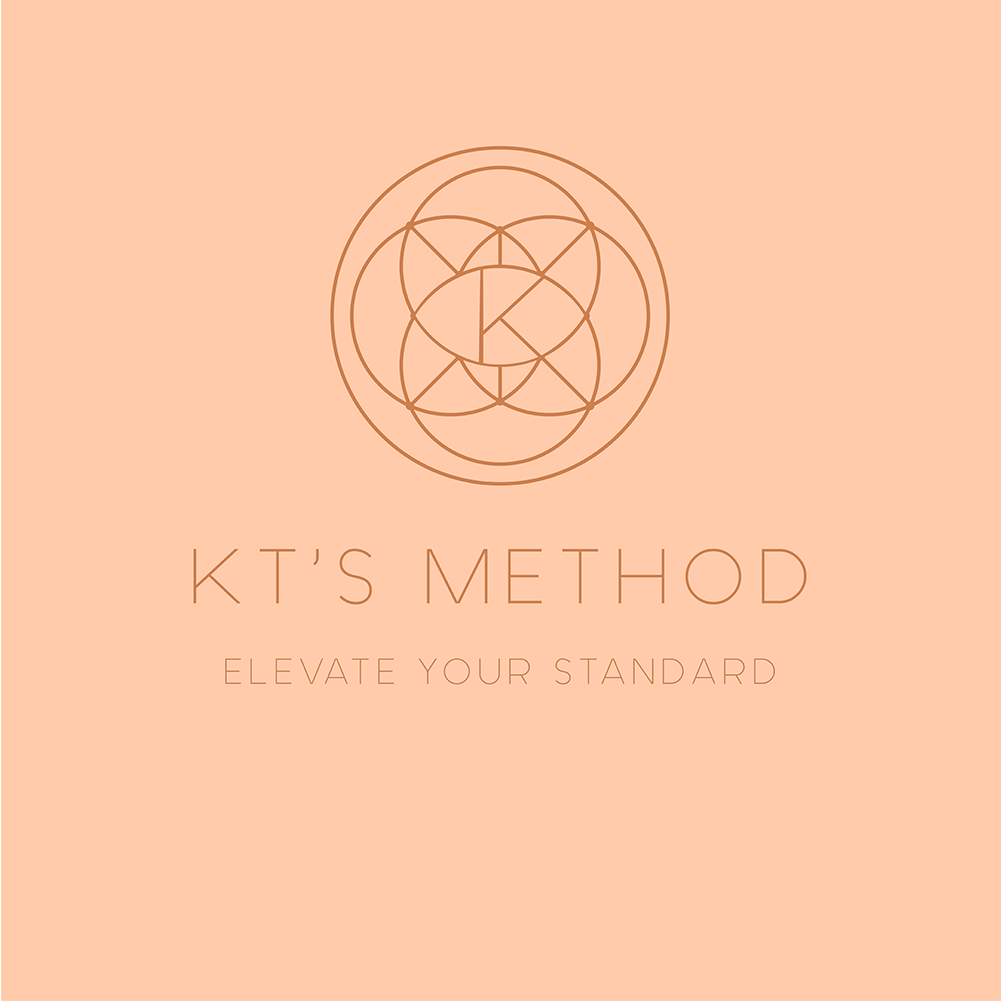
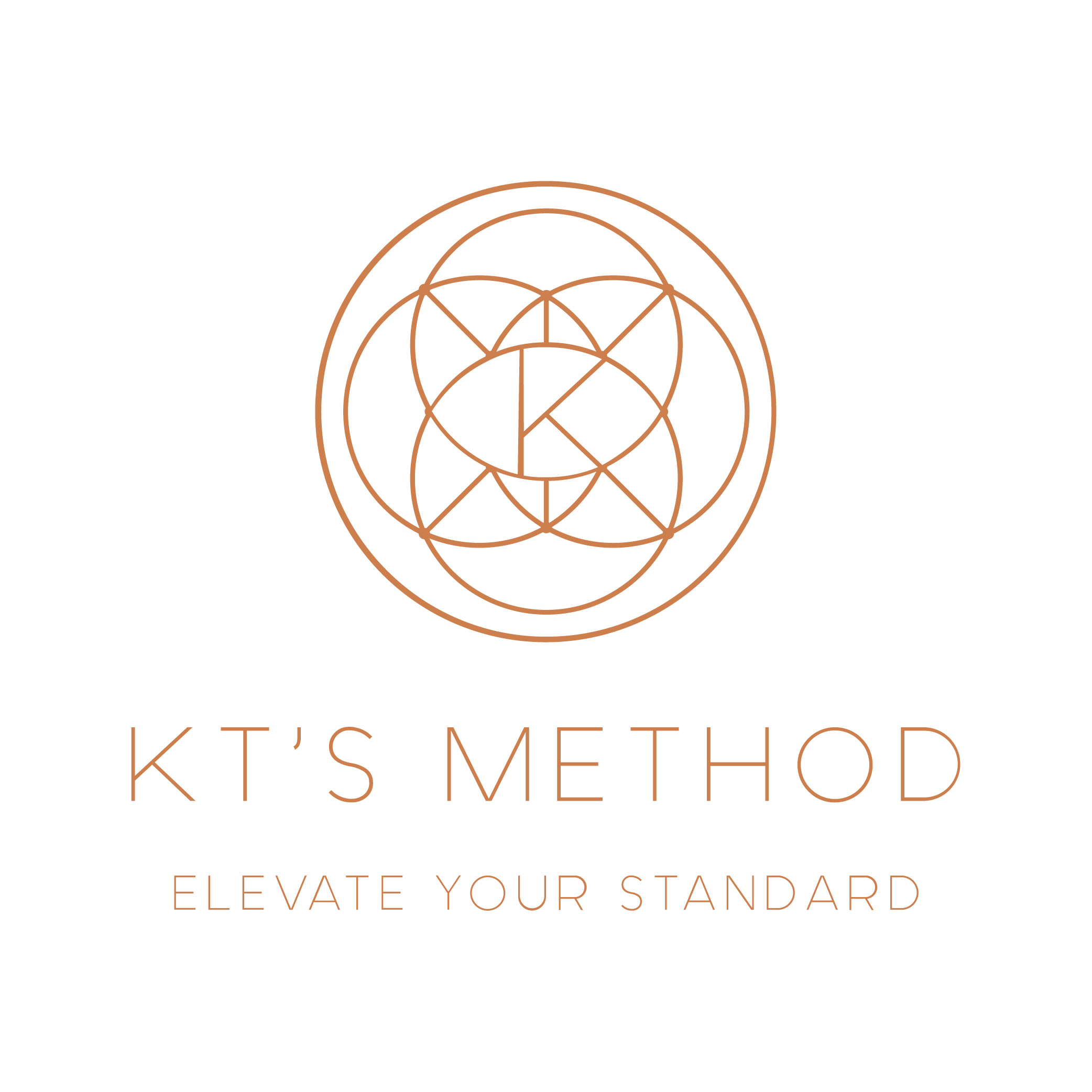
KT’S METHOD
Logo created for KT’S METHOD
A personal trainer ready to take her business to the next level with professional branding.
Goal was to incorporate the client’s personal style into the design while maintaining a clean and minimal style.
Copper and Rose gold was used to accomplish that along with a geometric design to express femininty whitout being overly cliche.
Part of a larger branding project including web design-
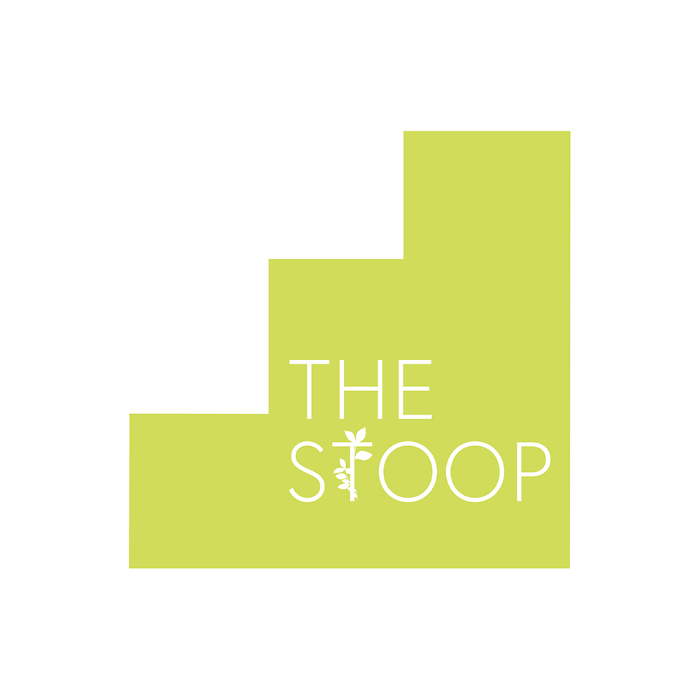
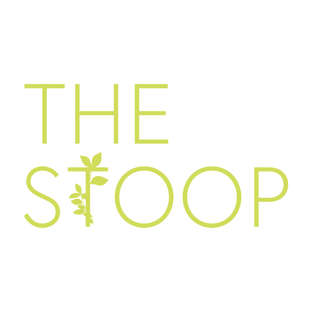
THE STOOP
Logo created for STOOP NY
A vegan restaurant located in New York, the goal was to interpret the vegan lifestyle / New York atmosphere and how to communicate that in the logo.
Created a “stoop” shape to illustrate that staple of New York architecture
To incoporate the vegan aspect a vine was added to the “T” to represent organic eating and healthier lifestyle.
Part of a larger branding project including web design-
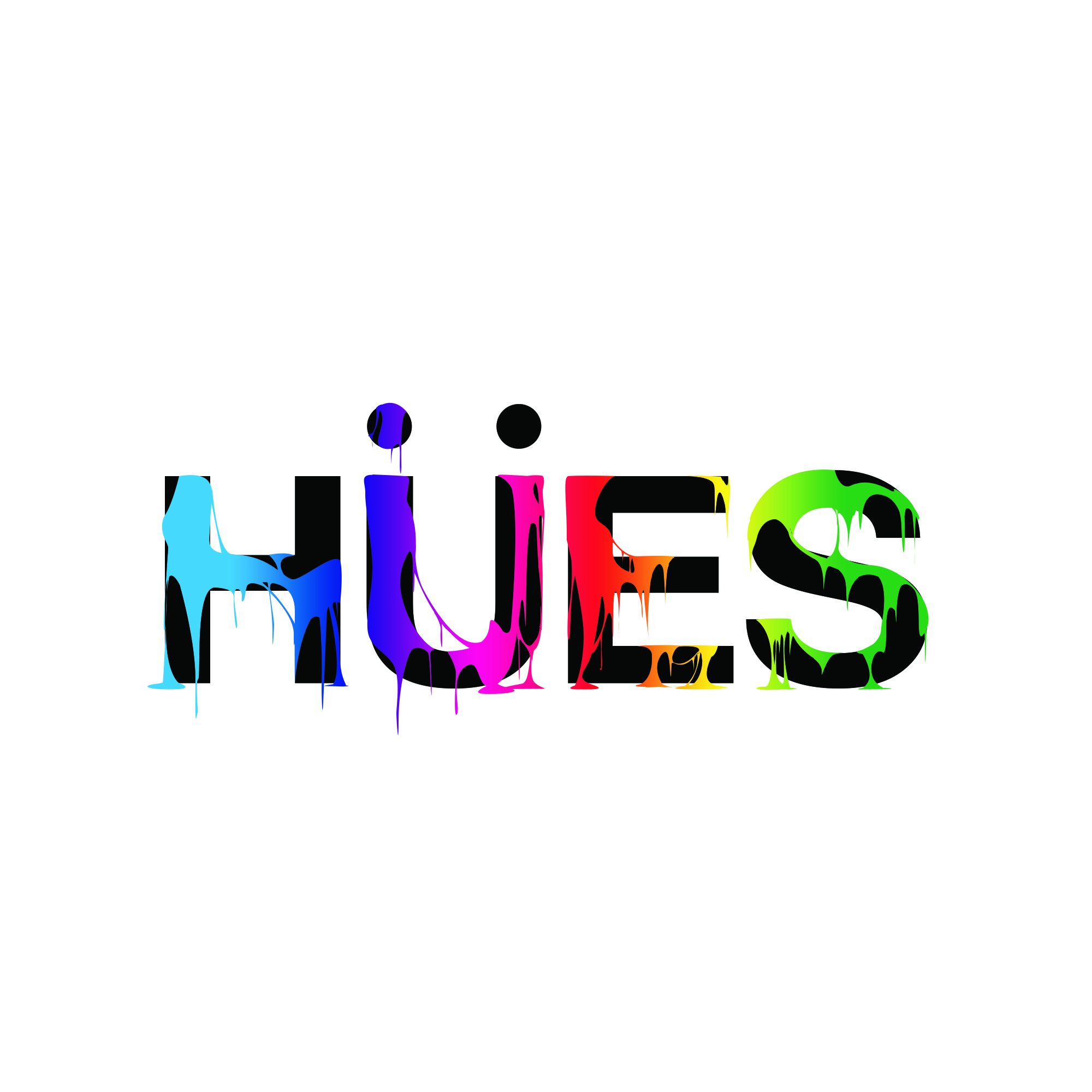
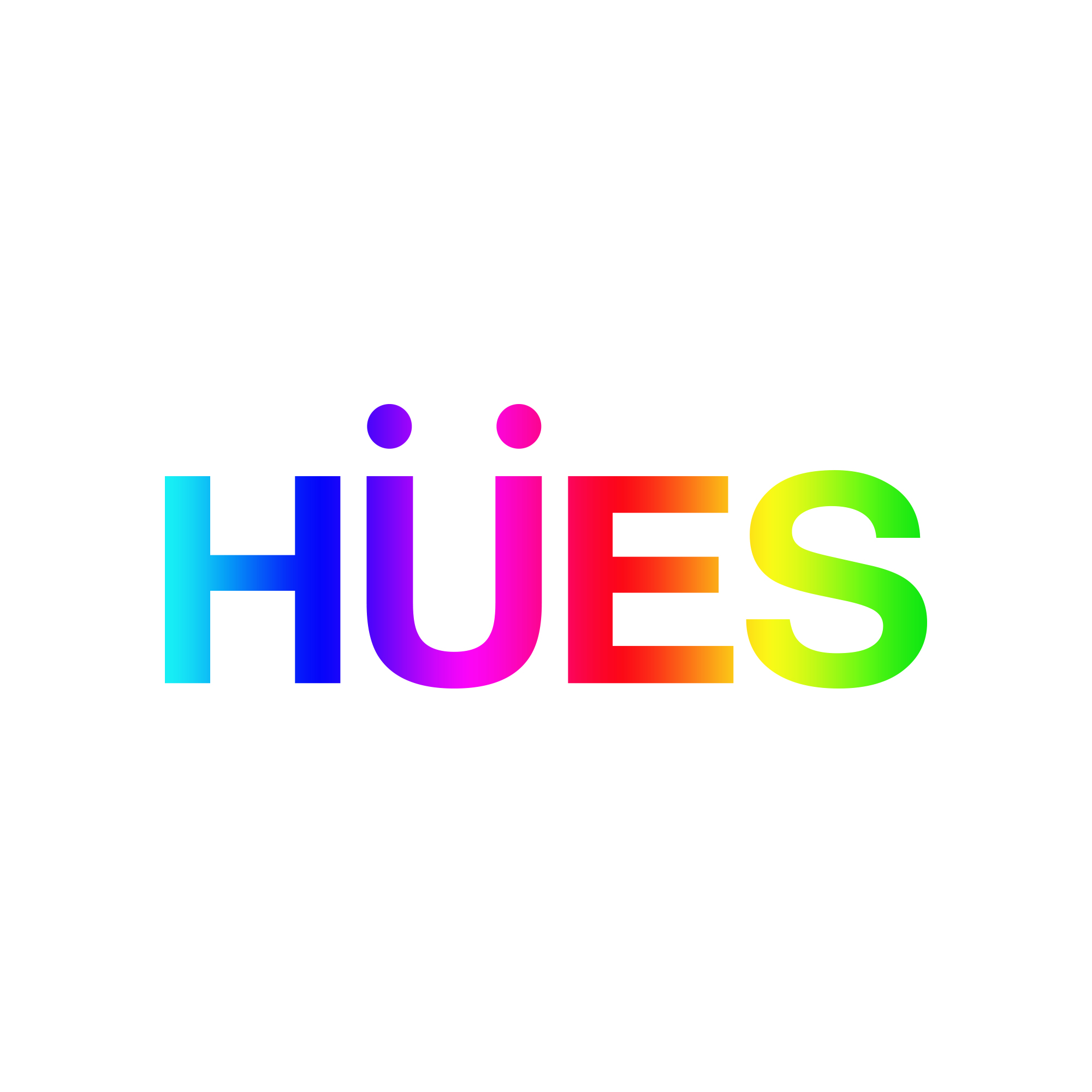
HUES LOGO REBRAND
Rebrand for jewelry brand HUES
Goal was to refresh their logo with a gradient version and a stylized “drip” version.
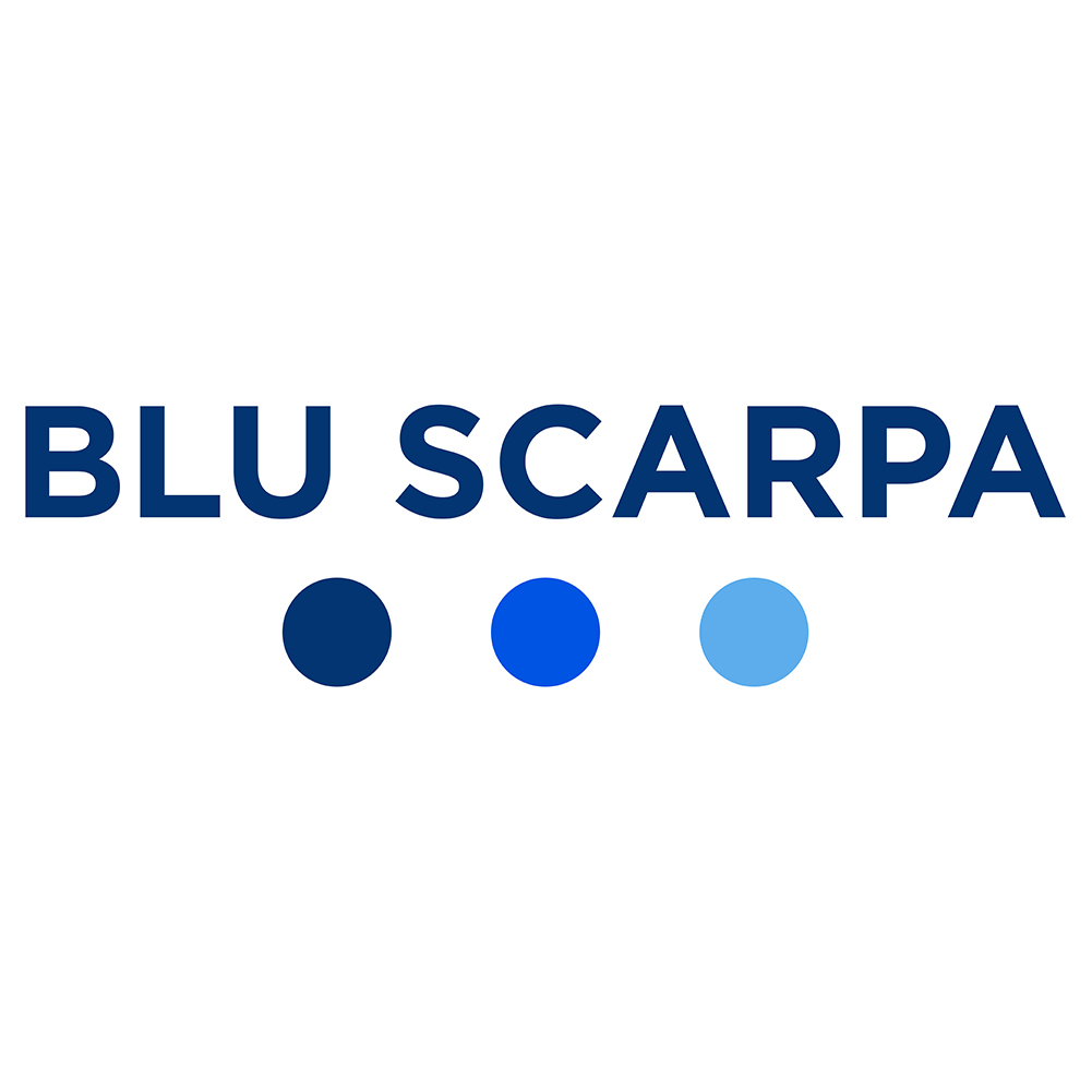
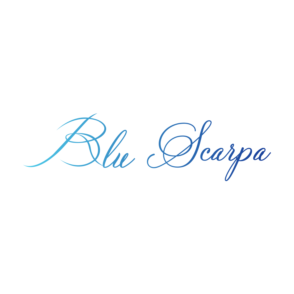
BLU SCARPA
Logos created for the launch of a new footwear company BLU SCARPA to be used on site and on products.
Goal was to incorporate the brands 3 colors in a clean and minimal way while staying true to the brands Italian roots.
The “3 dots” logo is used on branding and products with cursive version serving as an accent logo.
Part of a larger branding project-
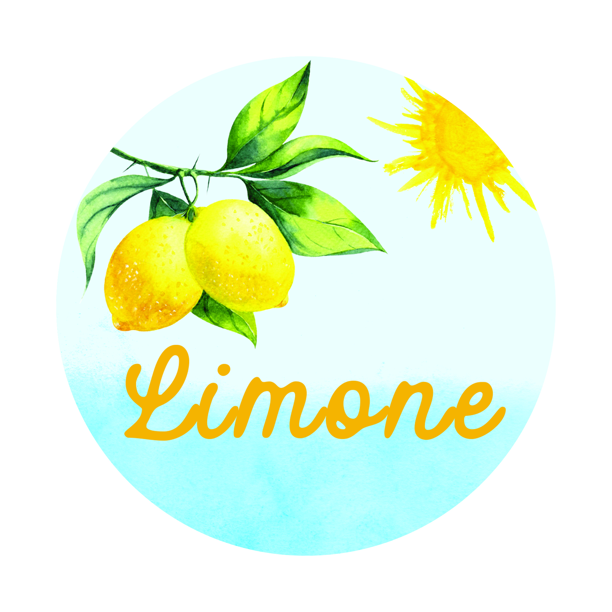
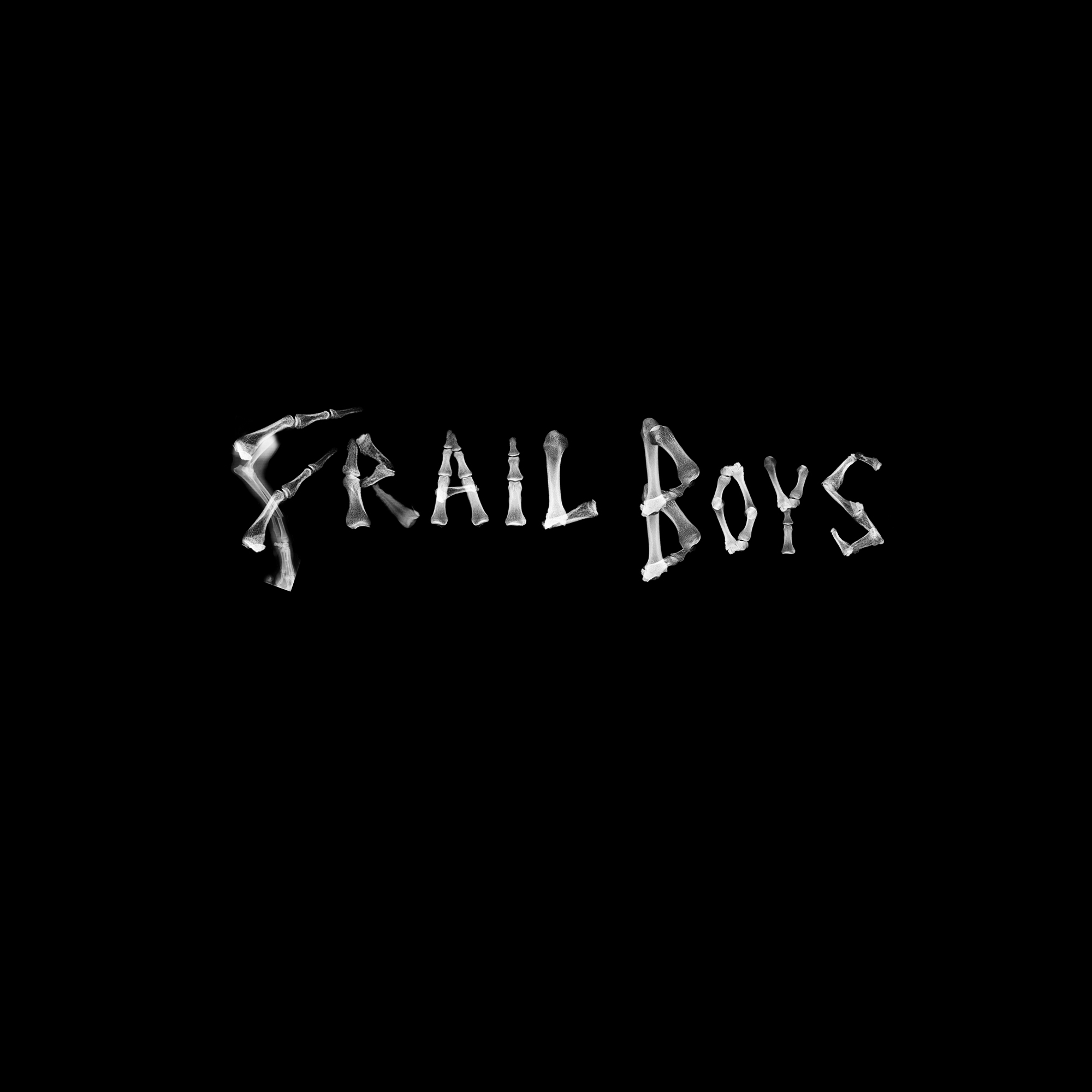
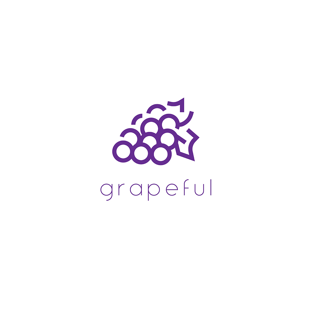
miscellaneous
Collection of miscellaneous logos that were created for various projects.